UX Design Process
Information architecture & order flow
To create a seamless broadband sign-up experience, the order journey was carefully structured to reduce drop-offs and increase efficiency. Each section was designed to minimise user effort while maintaining full transparency.
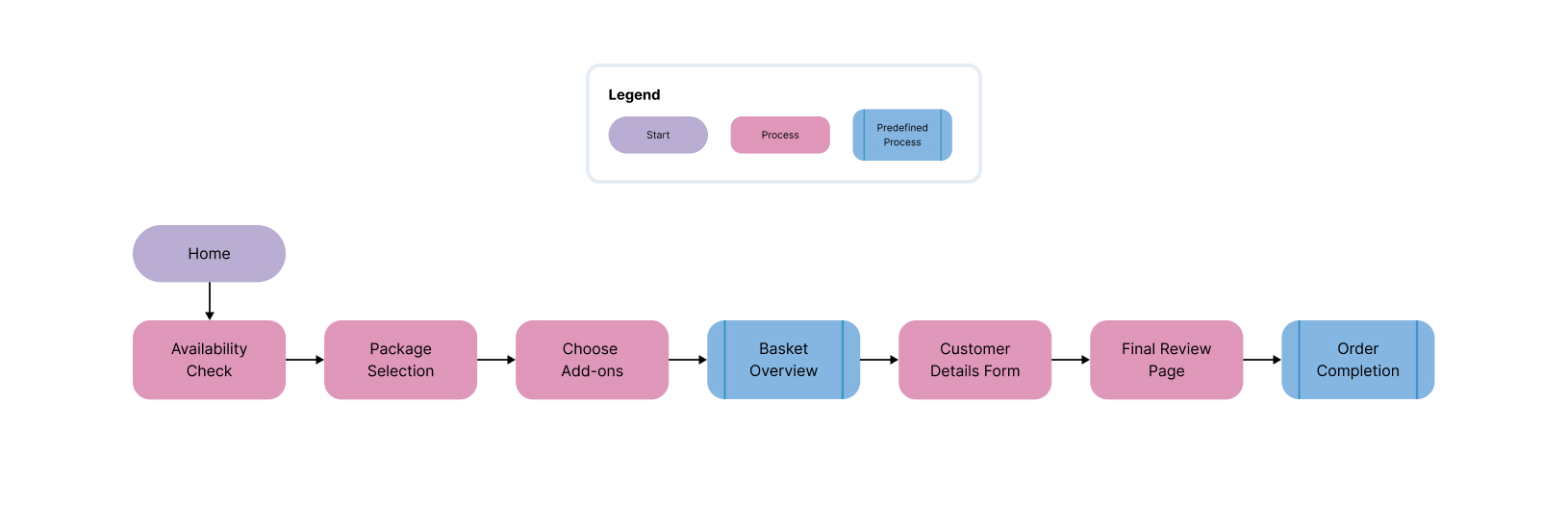
Order flow breakdown
- Availability Check: Users enter postcode first, confirming availability before investing in the process
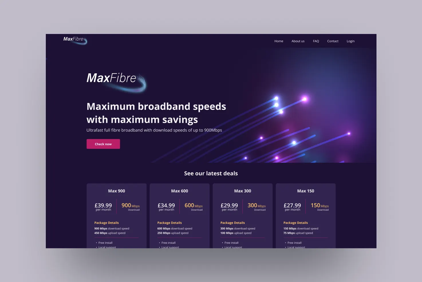
- Package Selection: Plan cards highlighting speed, cost, contract terms, and use-case badges like "Best for Streaming"
- Basket Overview: Review and modify selections with optional add-ons before committing
- Customer Details Form: Auto-fill suggestions, inline validation, reduced fields
- Final Review + Order Completion: Full summary with confirmation email trigger
Key design decisions
- Progress bar on every step so users always know how many steps remain
- Plan cards redesigned as horizontal comparisons on mobile, reducing scroll depth
- Checkout consolidated from 6 steps to 3 with smart defaults
- Live order modification: users can navigate back without losing entered data
A custom WCAG 2.0 compliant customer dashboard was also designed. Contact for access to the full interactive prototype.